A warm, calm brand identity, stationery, and web design for a Limassol paediatrician — built around a hand-drawn stethoscope monogram that feels human without losing medical trust.
THE PROBLEM
Medical branding tends to feel cold — sterile blues, hard edges, generic cross symbols. Dr. Koukli needed an identity that reassured the children and parents in her care while still signalling the credibility of a German-trained doctor. The tension: soft enough for kids, professional enough for parents and peers.
PROCESS
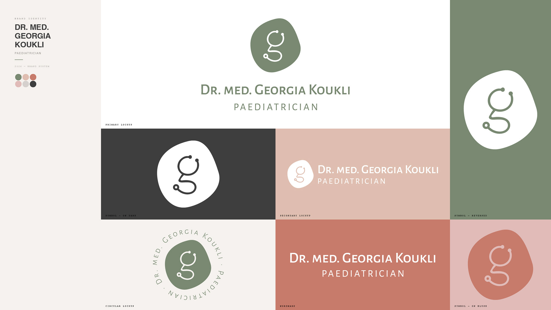
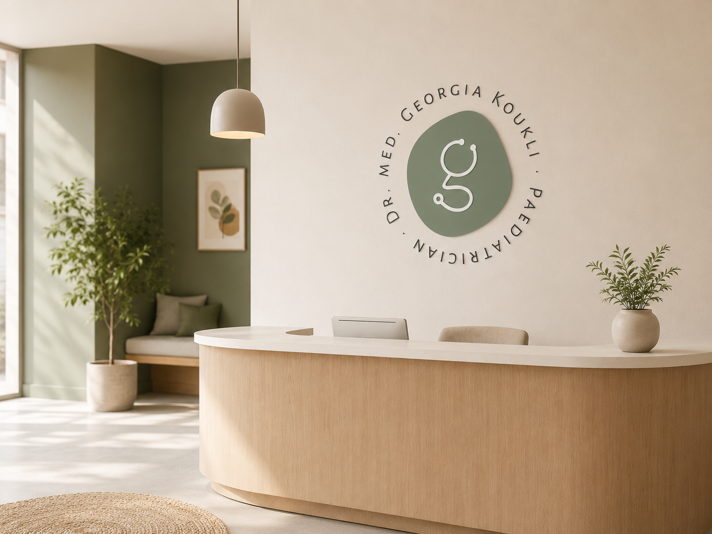
We anchored the identity on one idea — care drawn by hand. The custom "g" monogram was developed from a single continuous stethoscope line, looping into a friendly, approachable mark. Rigid frames were replaced with organic, pebble-like shapes, and a natural sage palette set the tone. From there we extended the system into patterns, colour, type, and a full suite of print and digital touchpoints.
SOLUTION
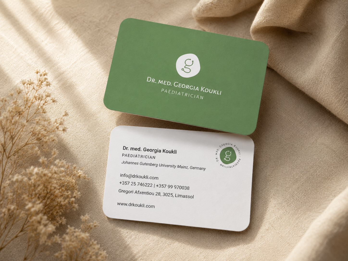
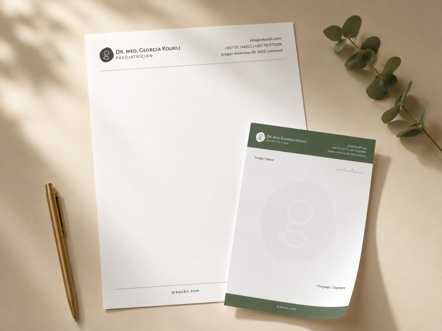
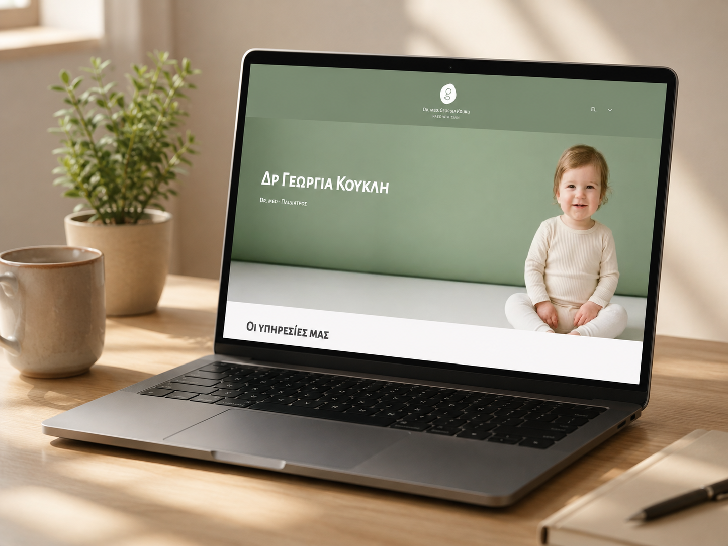
A complete visual identity: primary, secondary, symbol, and circular logo variations; a palette of sage, blush, terracotta, soft grey, and cream; a playful elephant pattern and concentric line work for child-facing pieces; and a refined small-caps serif for clarity and trust. Applied across business cards, letterhead, prescription stationery, signage, and a responsive website.
RESULTS
A cohesive, flexible identity that works from a tiny favicon to a clinic wall — calm and child-friendly on the surface, clinically sound underneath. The system gives Dr. Koukli a consistent, recognisable presence across every patient touchpoint, online and in practice.